- Client: Agencia Tributaria (AEAT)
- Language locale: Spanish 🇪🇸
- Project: Android app onboarding flow redesign
- Date: November 2020
- Tools: Google Docs, Figma, Atom, coffee ☕
- Link: Play Store
Some context
When our teacher at the UX writing course by Shifta asked which onboarding we wanted to redo and I told her it was the one from the AEAT android app, “you don’t know what you’re getting yourself into!”.
In fact, many of the changes proposed leaked into the space of user flow and UI design.
Still, this was my fantasy world and, aside from unicorns, I could bend reality to my taste - no devs or PMs saying “we don’t have the resources or tech to do that!”.
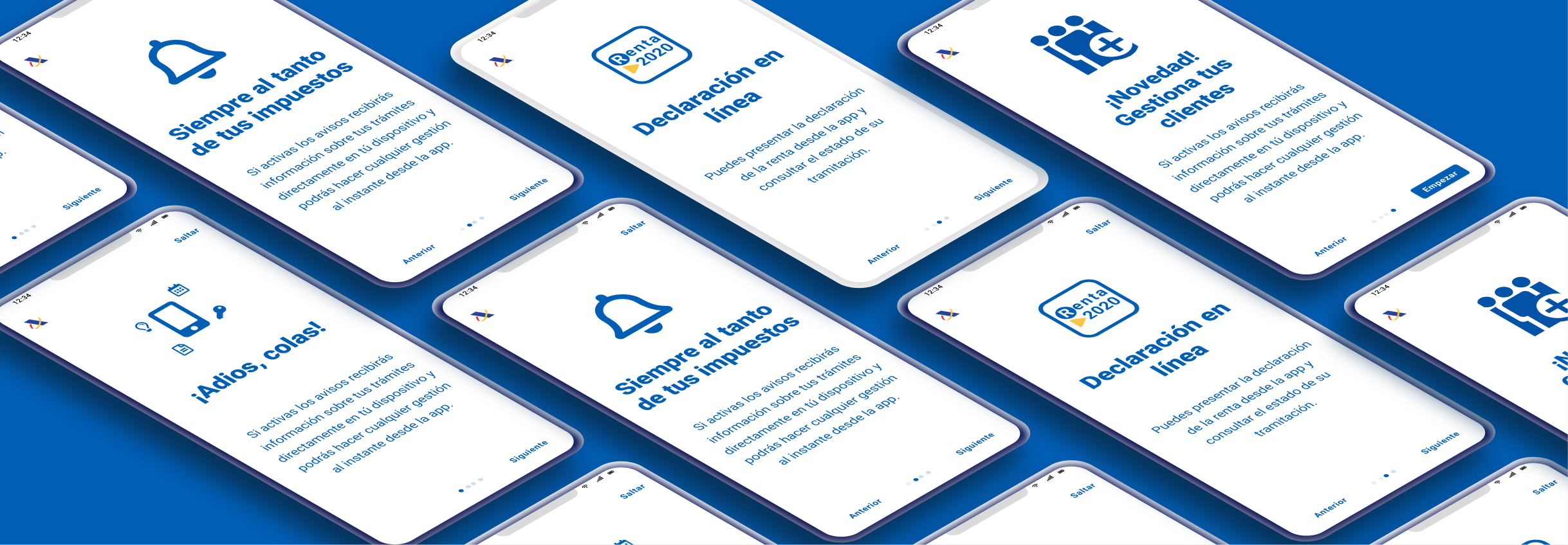
Screens
Want to see the behind the scenes of every screen? Check the Copy doc.
Challenges
Overall, I felt that the onboarding flow did not anticipate any of my needs or doubts as a user. What can I do with this app? How do I use it? How will it make my life better? These are the questions that I tried to answer and that informed my content proposals.
The strict relationship with the Cl@ve PIN system always got in the way. I decided to avoid mentioning it in the onboarding because at this point the user still has to engage with the app, so I thought it would be better not to overwhelm them. When they actually decide to sign up, the app would redirect them to Cl@ve PIN.
It wasn’t easy to escape the tentacles of jargon and avoid falling into assumptions in regards of what domain-specific terms the users were familiar with - think about “Cartera de usuarios” in the 3rd screen.
Being inclusive in Spanish is always challenging, but also very entertaining for language nerds like me. Especially for the excessive presence of masculine as the standard form in the language.
UX writing
- Formal language - notice the use of “Usted” when referring to the user - pointing to an overall distant tone
- It wasn’t easy to escape the tentacles of jargon and avoid falling into assumptions in regards of what domain-specific terms the users were familiar with - think about “Cartera de usuarios” in the 3rd screen.
- Being inclusive in Spanish is always challenging, but also very entertaining for language nerds like me. Especially for the excessive presence of masculine as the standard form in the language.
Flow
- The onboarding was only used to show new features. New users were left out of the picture
- The new feature presented seemed to be targeting only accountants who managed multiple users. What about users who just managed their taxes?
- The strict relationship with the Cl@ve PIN system always got in the way. I decided to avoid mentioning it at this point. The user still has to engage with the app, better not to overwhelm them. When they actually decide to sign up, the app would redirect them to Cl@ve PIN. Same for the privacy policy as the first screen of the onboarding.
Design
- The visual hierarchy on the following screens was non-existent
- Buttons did not stand out as clickable entities. The only visual clue provided is the use of all-caps
- I found it hard to relate the hero images used to the feature they were meant to describe
- The presence of both carousel icons and previous/next buttons seemed a little redundant, however, keeping it felt emphatic
- The color palette felt a little off, especially the color of the carousel dots
Usability
- The button to Skip the onboarding was missing
- The button to access the Onboarding (or Quick Tour) again once inside the app was also missing. However, this was out of scope for this case study
- I found it hard to relate the hero images used to the feature they were meant to describe
- The presence of both carousel icons and previous/next buttons seemed a little redundant, however, keeping it felt emphatic
- The color palette felt a little off, especially the color of the carousel dots
Problems Solved
- Get rid of the distant and cold tone
- Focus on the main benefits of the user
- Despite masculines slipped through in some occasions - was the only way to avoiding using always the same constructions - I was quite satisfied with the overall inclusivity reached by the copies from a gender-equality perspective
- Move what seems to be a edge case and a new feature to the last screen
- Moved the Cl@ve PIN reference out of the onboarding. At this point the user still has not engaged with the app and introducing a requirement that’s still not needed may be felt as overwhelming. Introduce the requirements only when they’re required.
- Tried to achieve a more homogeneous visual hierarchy and color palette
Learnings
Approach the storytelling from the same angle at every screen - either feature-based or benefit-based - makes the overall onboarding experience more cohesive by reducing cognitive load for the user.